Wander Woman
I used these concepts and ideas to inform the branding of the exhibit. I started with the logo, which will be displayed on the gallery’s window as a vinyl.
Initial logo iterations
![]()
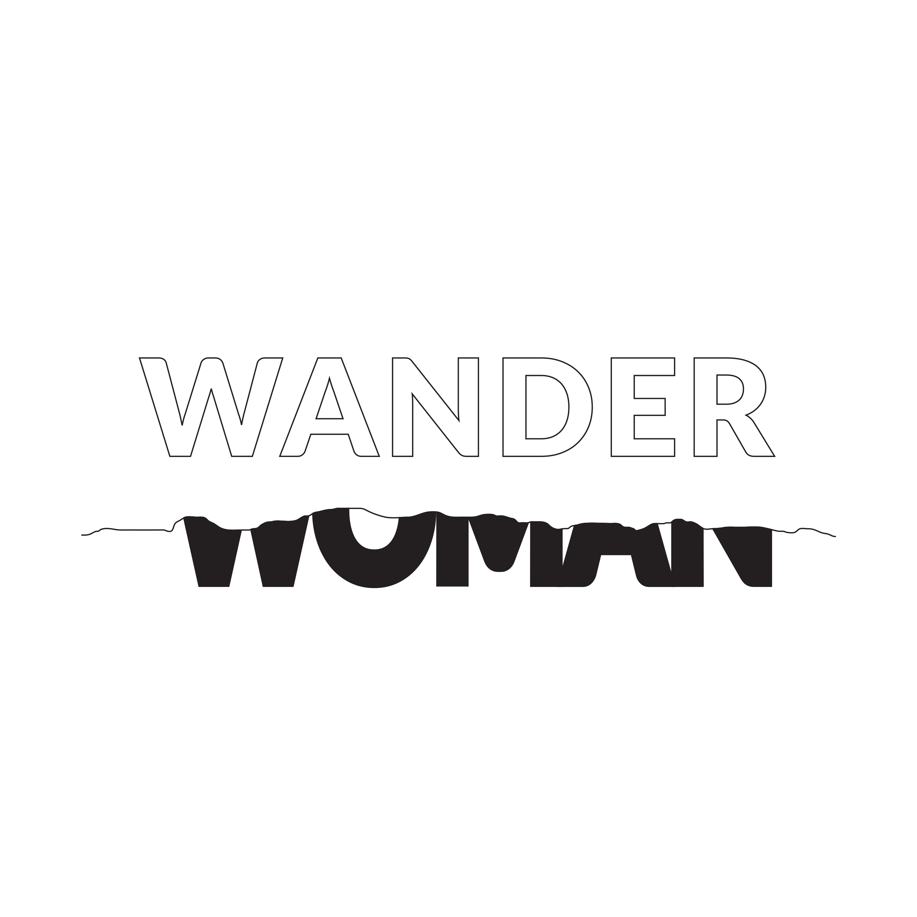
Final Logo
The concept of borders between countries and pushing boundaries informed the design of the final logo. The word “woman” is bolder, stronger, and stretched upwards to represent the strength of women pushing up against the boundary.I also designed a simple, animated version of the logo to be used for the closing reception of the exhibition, which involves a performance.
More coming soon!