IBM Blockchain: Hyperledger Fabric Documentation
PROBLEM SPACE
Users express dissatisfaction with Hyperledger Fabric’s documentation website, which is used primarily by blockchain developers. How can we make dense, complex, and technical information easier to digest and navigate through? Furthermore, how can we refresh the design and branding of Hyperledger Fabric?
DIAGRAMS / VISUAL LANGUAGE
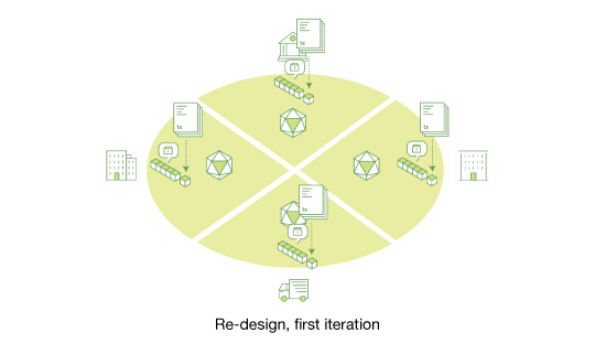
One of the key insights my team generated through the research is that diagrams are essential to improving the text-heavy documentation and they play a big part in helping the user easily understand blockchain concepts.
Through this insight, I helped create several key diagrams. The challenge of creating these diagrams lies in collaborating with the developers and content writers, as well as simplifying complex technical information. I also worked closely with the visual designers and developers while designing the diagrams.
PROBLEM SPACE
Users express dissatisfaction with Hyperledger Fabric’s documentation website, which is used primarily by blockchain developers. How can we make dense, complex, and technical information easier to digest and navigate through? Furthermore, how can we refresh the design and branding of Hyperledger Fabric?
DIAGRAMS / VISUAL LANGUAGE
One of the key insights my team generated through the research is that diagrams are essential to improving the text-heavy documentation and they play a big part in helping the user easily understand blockchain concepts.
Through this insight, I helped create several key diagrams. The challenge of creating these diagrams lies in collaborating with the developers and content writers, as well as simplifying complex technical information. I also worked closely with the visual designers and developers while designing the diagrams.

I had these questions in mind while creating the diagrams:
How well do these diagrams match up with the concepts they are trying to convey? Or in other words, are the diagrams technically correct?
How well is a user able to read and understand the diagrams clearly?
How well do the diagrams support the content on the documentation?
What are impressions of the documentation as a whole?
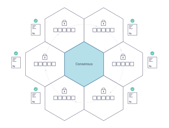
Final version of “Consensus” diagram
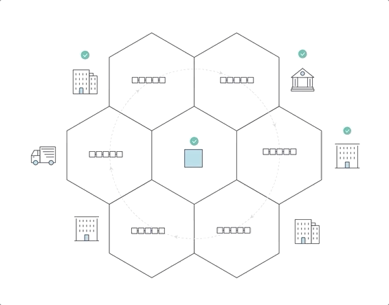
Animated diagram showing how blockchain works
NAVIGATION AND WIREFRAMES
Another insight we had is: because of the dense and low discoverability opportunities in the current documentation, the information architecture needed restructuring. I worked with a researcher, Raissa, to map out the architecture of the page and created user flows. From there, I re-designed the navigation menu for the website.
OUTCOME
This project was a huge learning opportunity for me, as I got to touch on many different areas of design including UX, visual, and research. It was also an opportunity to collaborate with a diverse team while designing within a technical field. The diagrams we produced now live on the website’s Key Concepts section. My team and I made a tremendous first step on the improvement of the documentation.
New navigation sidebar designed for density
![]() Wireframe of the content page and new sidebar
Wireframe of the content page and new sidebar
 Wireframe of the content page and new sidebar